The worst blog on the internet
The Other Fella has been blogging for a few weeks now.
I havenât mentioned it much before, as I hoped heâd grow bored of it and go away.
It is one of the worst blogs I have seen in ages.
He even had the neck to call it The Other Fellow. How fucking mimsyish is that?
Most of the time he writes about me, which is very sad. He obviously has no life of his own. And when he isnât blogging about me he is off on some wimpish train of thought that is as boring as hell. His last post was a pathetic whimper about trees in the garden, for fuckâs sake!
I swear the only reason he gets any visitors is because he has picked up a rather neat design. His site looks nice, Iâll grant him that.
I have been thinking about the design of this one for a long time now, but I just canât seem to find something suitable. Iâd like one as neat as his, so I found where he got it and had a look at some of the other designs there. They are nice.
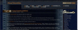
There is this one –
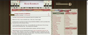
Or this one –
They both look nice but they arenât really suitable. They both would need a lot of tweaking, and Iâd have to ask him to do it. There is no way that Iâm going to give him the satisfaction.
Help me out here. I need suggestions. Does anyone know anything about themes or how to write them or anything?
And in the meantime, steer well clear of The Other Fella.
A blog that bad shouldnât be encouraged.


Obviously, you’re not keen on theme tweaking, what with your pills and soldiers and flaming cars. But I’m not much help. I’ve been trying to find that little comment link to put in my feeds like you have, and it’s proven to be quite evasive. I checked feedburner, as you suggested (or was it the other fellow?) I’ve gone through all of the WP plugins I could find. Nothing.
I need more coffee.
Em… you’ve probably just got him an additional few hundred views.
Thank god he has that feedburner reader widget thing on the side, I was beginning to get upset that I get less comments than the worst blog on the internet.
Obviously, you need to just steal the Other Fellow’s, and leave him with cobwebs.
RhodesTer – This theme is already tweaked [you don’t think they sell ’em like this?]. Drop me a line about the plugin you want and give a bit more detail….
BBBB – Will you please stop changing your name. You keep getting stuck in moderation! I think you overestimate my readership? A few hundred views? Do you get less comments?
Susan – I like the style of his theme but it wouldn’t suit me. It’s too gay. I need something with a bit of action.
Amazing what advertising on here can do – are you thinking of retiring and sending all your readers to ‘the other fellow’? Oh wait – i think you just did!!!!!
AH F*CKING WI-FI VERIFICATION KILLING HUGE COMMENT F*CK F*CK F*CK.
Hundreds isn’t an insane figure, people will revisit and such… easily bringing it into hundred.(this was much longer and detailed first time round)
Sorry bout the name thing, Firefox lists every username I have everywhere in your box for some reason.
I average like 4… so yes.
I see you’ve been searching high and low for the answer to your theme question..
http://picasaweb.google.com/lh/photo/LZBM7Sbc6caniMfsJeChPg?feat=directlink
I am unable to post or read comments on his site. Not intentional I am sure. ?
Kate – Are you suggesting that my loyal followers should desert me for that runt? You have little faith.
BBB[B] – I doubt they’ll stay long. Incidentally, your WiFi has taste?
RhodesTer – Nice one! 😉 I leave no stone unturned.
TT – Others seem to manage [unfortunately]? I hope you wanted to abuse him? 😈
Is there any particular reason for this rather vitriolic attack?
Two words, Richard.. Guinness.
..oh, wait..
Richard – Because I can. Heh!
I like them both, but I agree that your theme should be a little more…er…hard core. I never knew split personalities could be so much fun!
Firstly, your “stuck in moderation” quote has given me the perfect title I needed for my forthcoming movie styled on Sofia Coppola’s “Lost in Translation” – thanks for this Grandad!!
Secondly, blogging on a black background fails fails fails. I speak not only from an experienced graphic design opinion, but more so from a blog-reader opinion. It’s cool with print media – not web media.
The other theme you suggest looks like a recipe book. Your choice my friend.
Thirdly, the Other Fellow doesn’t give out about anything. Why is that? Sure isn’t all Irish wit [this century and the last one at least], revolved around shit-stirring and provoking unrest among the people? You have him tied to a chair somewhere and drugged up with happy pills I suspect.
Fourthly, eh…dunno. But I’ll think of something;)
Oh yes, remember fourthly now….is Herself married to Grandad AND The Other Fellow?? [raises eyebrow].
Fifthly [as opposed to Filthy]; what am I doing here @ the weekend and not on company time???
i like the blue jean one even if dark blogs supposedly don’t work. they sure are easier on the eyes for me. the other one is waaaaay too pink and does look like a recipe blog. i like the other fellow, but then i would.
Taste? What?!
Every 20 minutes/200mb I have to re-enter my password
You could do a readers’ survey. But, I wouldn’t.
You can pretty much do what you want with this one:
http://www.yvoschaap.com/wpthemegen/
Might work for you, I found it alright.
Absolutely agree with Spaghetti Hoop’s obs – there is a huge dichoctomy going on here ….big problem….not a convenient place to be or not to be – that is the question…
E Mum – I thought you’d like the colour of this. It is somewhat pinkish?
SHoop – I couldn’t agree more about pale text on a dark background. As EMum says, this one needs to be more hard core, or something, or whatever. Yer Man is always up to his eyeballs in Vallium or something. I’ll hide his stash and see what happens. 😈
P.S. Herself is a free thinker. *cough*
Prin – I like it too, BUT it just doesn’t work for this site. I may resort to trying my own design, if I can do it.
TT – Too much hassle. You lot would only lie through your teeth anyway.
Maxi – Changing the colour is no problem. It’s the graphics that are the tricky bit.
Milton – Don’t worry about it. You’ll give yourself a headache?
Ah, tell that other fella to feck off. What you need is here: http://www.darrenhoyt.com/2008/03/11/a-wordpress-theme-for-barack-obama-supporters/
Of course, you’d have to blur out the ‘merkan flag. 🙂
Nice design, JD but you can’t be serious? If I took everything Mercan off that site there’d be nothing left!
@Grandad Too true. 🙂
Don’t like either of the ones you’re considering. Why don’t you design your own?
Why is my comment suddenly awaiting moderation? Have you tightened up your security? Anyway, back to the design, if I was you I would design something similar to the book cover.
I know how to write bland, monotone themes, with some very complex bits of coding and template files if that helps 🙂